SJST Power Rankings
Chardougla 2 October 2017
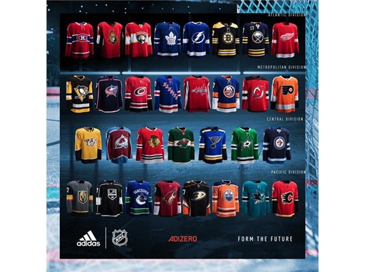
Welcome to everyone’s least favorite, yet oddly popular, type of article. Power Rankings. Today, as part of our SJST preview, our writers pooled our collective geniuses to create a totally comprehensive ranking of the Pacific Division teams. Only, instead of ranking their roster makeup and chances at the Cup (that’s boring and lame), we instead found the real hot-button issue everyone has been interested in; jerseys. Yes we will be ranking the sweaters and logos of the Pacific Division teams. To be clear, both home and away jerseys have been taken into consideration. With that said, away we go:
8) Los Angeles Kings

Horrific. Blah. Snoozefest of epic proportions. If I was a soulless mons-I mean LA Kings fan, I’d be furious that this is what passes for a uniform in the “entertainment capital of the world”. Disgusting
7) Anaheim Ducks

I’m higher on these than some, but my god Anaheim. You took one of the coolest logos and colors in sports, and replaced it with one of the blandest. I mean, the current ones are at least an upgrade over their hideous jerseys from their Stanley Cup run, but still. Ya done goofed Anaheim, ya done goofed.
6) Vegas Golden Knights

This one for me is a tale of two parts. On one hand, the actual jerseys aren’t too bad. The color palate is pleasing, and despite some odd red in there, and the insistence on the use of white gloves, it works. The problem lies in the logo. I mean really Vegas? That’s the best you could do? There were so many other, better directions you could have gone with this. I had them higher, but ultimately my fellow writers couldn’t get over a logo that Irbe’s Pads aptly described as “some NHL 15 ultimate team logo”.
5) Edmonton Oilers

The blue body, orange shoulders were classics that evoked images of the Great One accomplishing legendary deeds and winning Cups. The Oilers took a look at that legacy and decided to shit all over it by doubling down on their horrific “Orange Crush” unis and somehow making them worse. They took one of the most iconic jerseys in the sport and decided to turn it into a dumb pumpkin looking piece of shit that’s an affront to all of our collective senses. Sufficed to say, I had them ranked lower than this.
4) Vancouver Canucks

A very average jersey. The jerseys are fine. They get this ranking by virtue of not having bad jerseys. There’s really not much else to say about these. Very generic.
3) Calgary Flames

There’s a lot of potential in this jersey. A lot. The rust red looks tight. The flaming C is simple, yet elegant and really works. I think what holds this jersey back a bit is the use of black. It kind of darkens the look. I really wish they’d go back to the old jerseys with the white C. Those looked fire, pun intended. Oh well, these are still pretty good. Now, onto the really good jerseys.
2) Arizona Coyotes

These were very meh up until a couple years ago, when they did an update. The black upper arms gave the jerseys the dynamism that they were missing in their old full reds, and catapulted them into the upper echelon of jerseys. The adidas update wisely made minimal changes to this well made and designed sweater.
1) San Jose Sharks

Come on, was there any doubt? The teal is just iconic. A modern classic. The latest update just improved what was already arguably the top jersey in the league. I maintain that the all white away jerseys are the top away jersey in the league. Just a clean set of jerseys, elegant in their simplicity and their knowledge of their best attribute, the eternally awesome Pacific teal.
So that’s it. Now you can sleep at night knowing you have a definitive knowledge of the division’s top jerseys. Ah who am I kidding, these are power rankings. I expect you all have a different version of these, except for the #1 slot (I hope). Let the dissension commence!

How dare you post a picture of a Kings jersey on this website!